Graphics
     #first get some data
datafilename="http://personality-project.org/r/datasets/maps.mixx.epi.bfi.data"
data =read.table(datafilename,header=TRUE)  #read the data file
#see the graphic window for the output
boxplot(epi)        #boxplot of the five epi scales
hist(epiE)          #simple histogram
plot(epiE,epiImp)    #simple scatter plot
model=lm(epiImp~epiE)  #find the regression of Imp  on E
abline(model)          #show the best fit regression line
pairs(epi)           #splom plot
Boxplot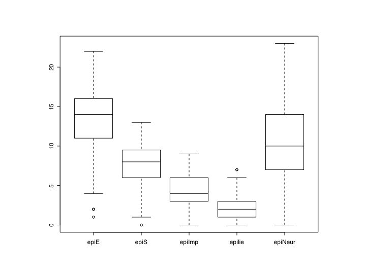
Histogram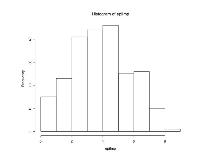
Simple scatter plot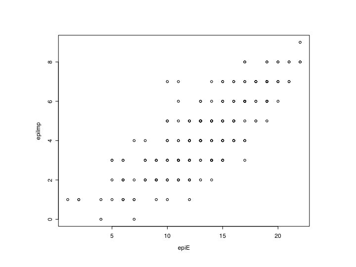
Basic ScatterPlot Matrix (SPLOM)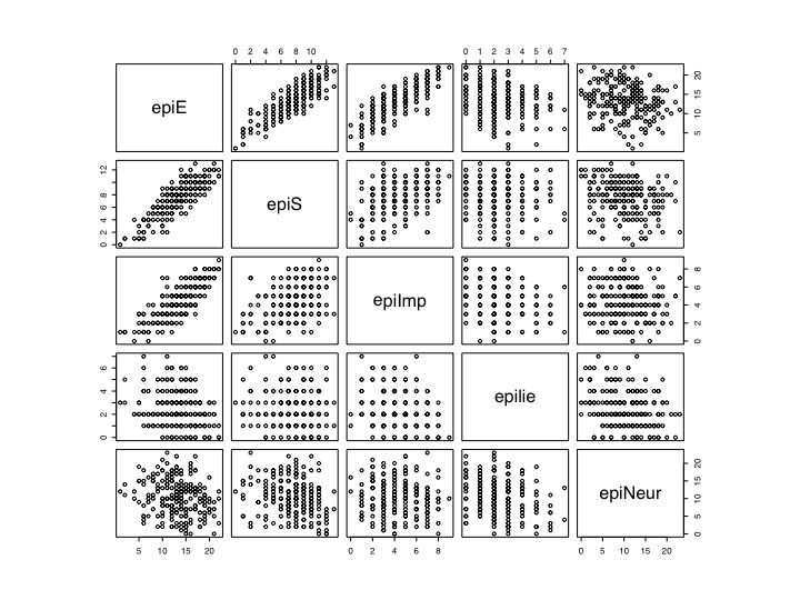
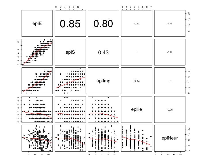
More advanced graphics take advantage of the power of R to operate on the figure. The following code is taken from the help menu for the pairs command. It shows a SPLOM in the lower diagonal and reports the correlation coeffients in the upper diagnonal, scaling the font size to reflect the absolute value of the correlation. Note that once the function (panel.cor) is declared, it can but used later for other plots.
## the following code and figure is adapted from the help file for pairs

##   put (absolute) correlations on the upper panels,
## with size proportional to the correlations.
#first create a function (panel.cor)
     panel.cor <- function(x, y, digits=2, prefix="", cex.cor)
     {
         usr <- par("usr"); on.exit(par(usr))
         par(usr = c(0, 1, 0, 1))
         r = (cor(x, y))
         txt <- format(c(r, 0.123456789), digits=digits)[1]
         txt <- paste(prefix, txt, sep="")
         if(missing(cex.cor)) cex <- 0.8/strwidth(txt)
         text(0.5, 0.5, txt, cex = cex * abs(r))
     }

 # now use the function for the epi data. (see figure)

  pairs(epi, lower.panel=panel.smooth, upper.panel=panel.cor)


 #use the same function for yet another graph.
  pairs(bfi, lower.panel=panel.smooth, upper.panel=panel.cor)
Scatter plot matrix of EPI scales -- font size adjusted for absolute value of correlation
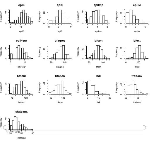
#this next command defines a new function which can then be used
#for making multiple histograms

multi.hist <- function(x) {nvar <- dim(x)[2]  #number of variables
     nsize=trunc(sqrt(nvar))+1   #size of graphic
     old.par <- par(no.readonly = TRUE) # all par settings which can be changed
     par(mfrow=c(nsize,nsize))       #set new graphic parameters
     for (i in 1:nvar) {
     name=names(x)[i]                #get the names for the variables
     hist(x[,i],main=name,xlab=name) }  #draw the histograms for each variable
     on.exit(par(old.par))   #set the graphic parameters back to the original
     }

#now use the function on the data

multi.hist(person.data)   #draw the histograms for all variables  (see above)
part of a short guide to R
Version of November 26, 2004
William Revelle
Northwestern University